A knowledge sport that connects people and information
Bridger is a web application of Bridgit, and part of Skool, an EdTech platform. Bridgit is based on a new kind of Internet technology, the Overweb : a trust layer over the current web that allows the building of 'bridges' that provide deeper context and crowd-sourced validation.
During this internship I had the opportunity to collaborate remotely with an international team of UX designers, CEO and developers, to build the Bridger web application. On the last month, I was offered the Co-Lead role for the UX Team, to coordinate and organize all activities for the completion of a high fidelity prototype for Bridger, including:
LEARNING CURVE
This was my first time working as part of a multidisciplinary team remotely, with members located across different time zones, including America, Europe and Africa.
I also had never worked with a design system before, so this project was a great learning experience in that area. By building an entire design system from scratch I got to understand guidelines for accessibility, style guides, content and vocabulary, and technical considerations for software development.
Finally, the design process included the challenge of understanding and being able to translate a new and complex concept such as 'making bridges' to the users.
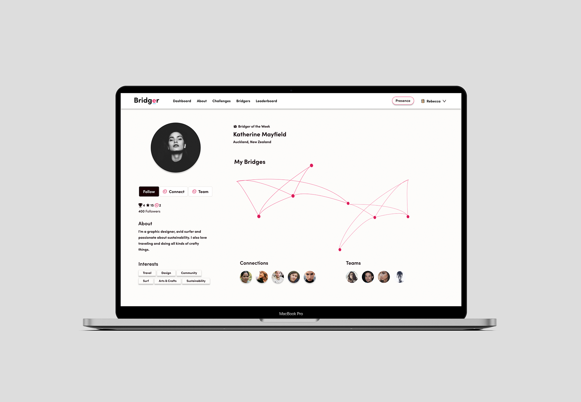
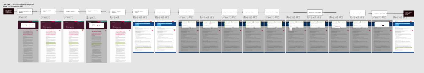
The first objective was to finalize a Proof of Concept prototype for Bridger on how to make a bridge in the context of a challenge. For the purpose of this POC prototype, we focused on the educational aspect of Bridger, resulting on our target users being students and teachers at middle and high school levels.
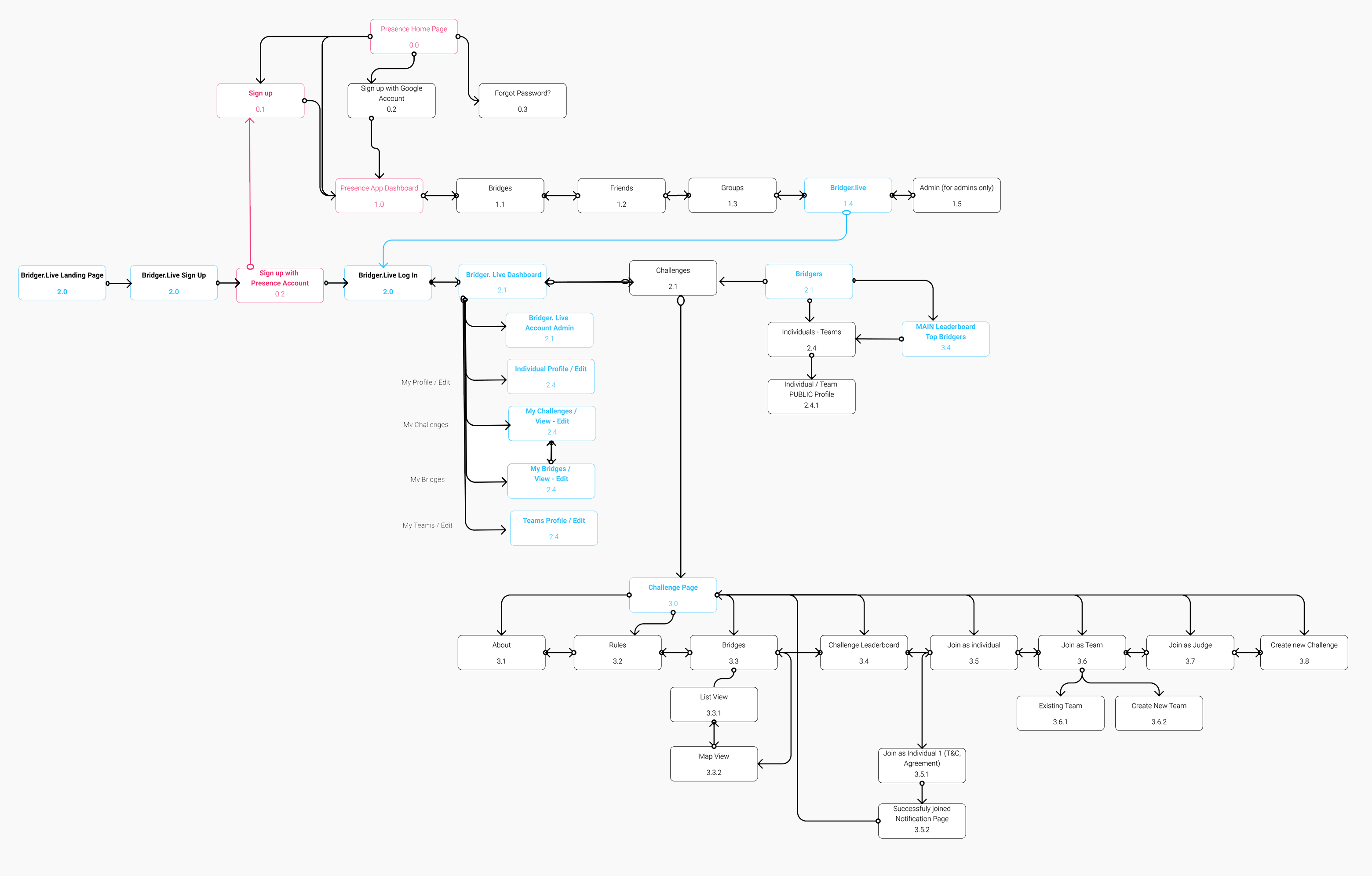
Bridger Sitemap (Sign up using Bridgit's Presence Chrome extension)
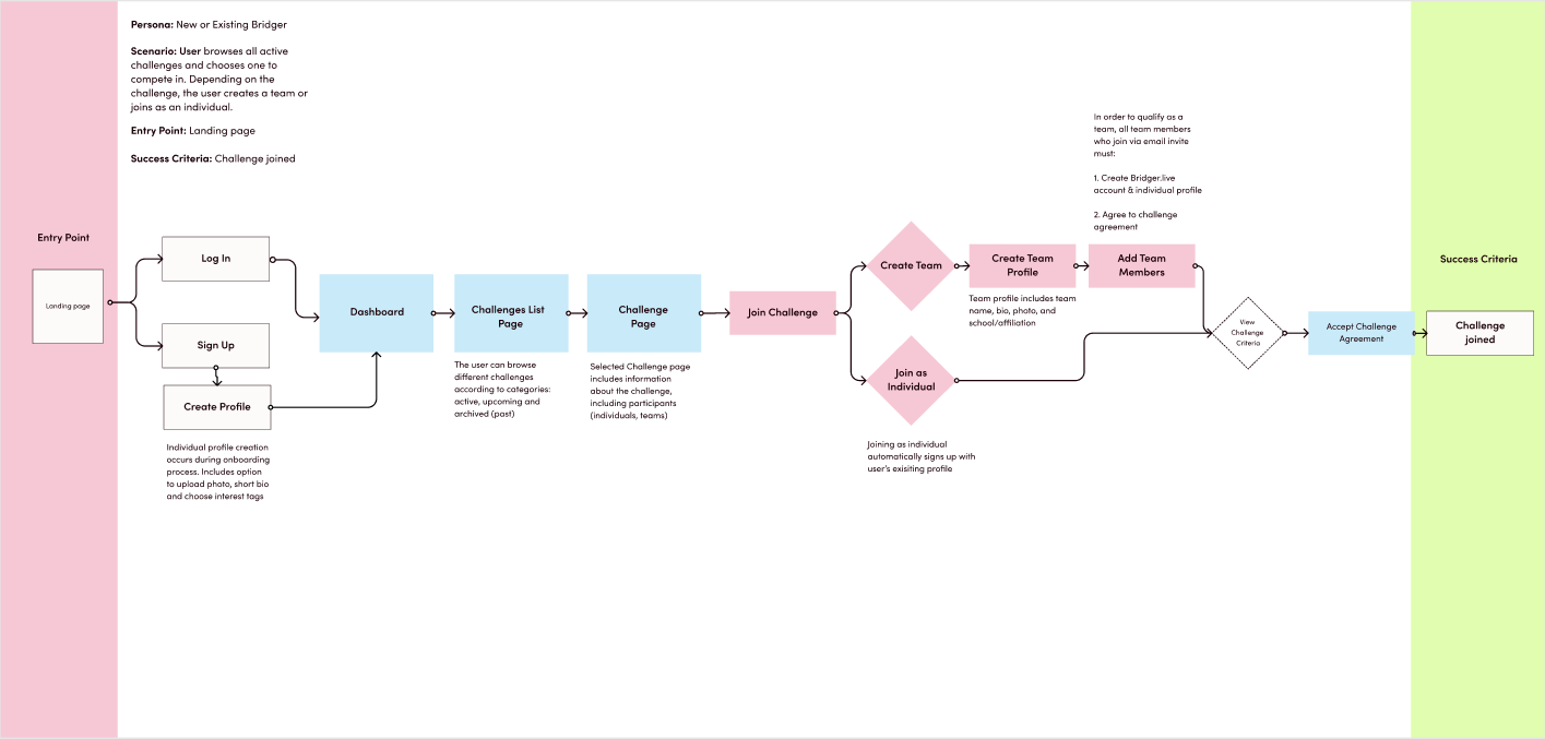
Join a challenge - User flow
We went through different iterations of the POC prototype, to design the Join a Challenge user flow and Make a bridge in the context of a challenge. This process resulted in the V3 prototype, which we used to test with students and teachers at High School level, with the challenge topic: UK 2021 elections.
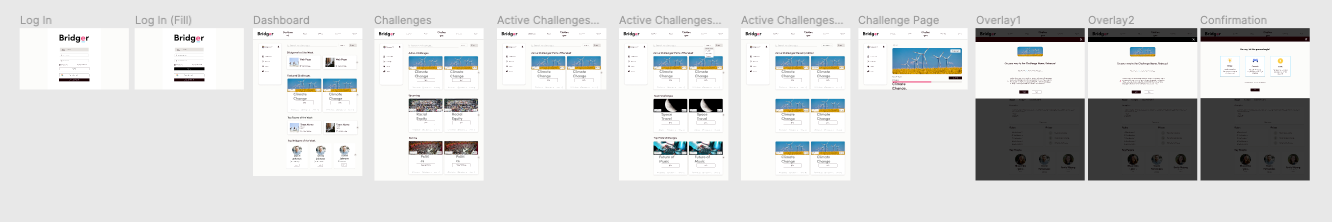
V2 iteration (Join a challenge)
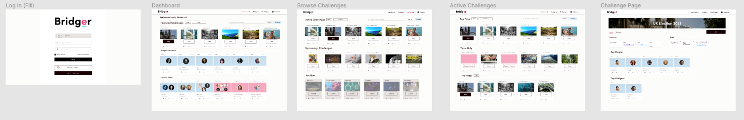
V3 iteration (Join a challenge + make a bridge)
We also worked on other features of Bridger to be tested afterwards, including account administration and social interaction functions.
V4 Prototype | Account admin of challenges and bridges from each challenge
We conducted a series of interviews and user testing sessions remotely, to assess the usability of the prototype. We then had a group affinity mapping session on Miro, to analyze the findings and results from user testing.
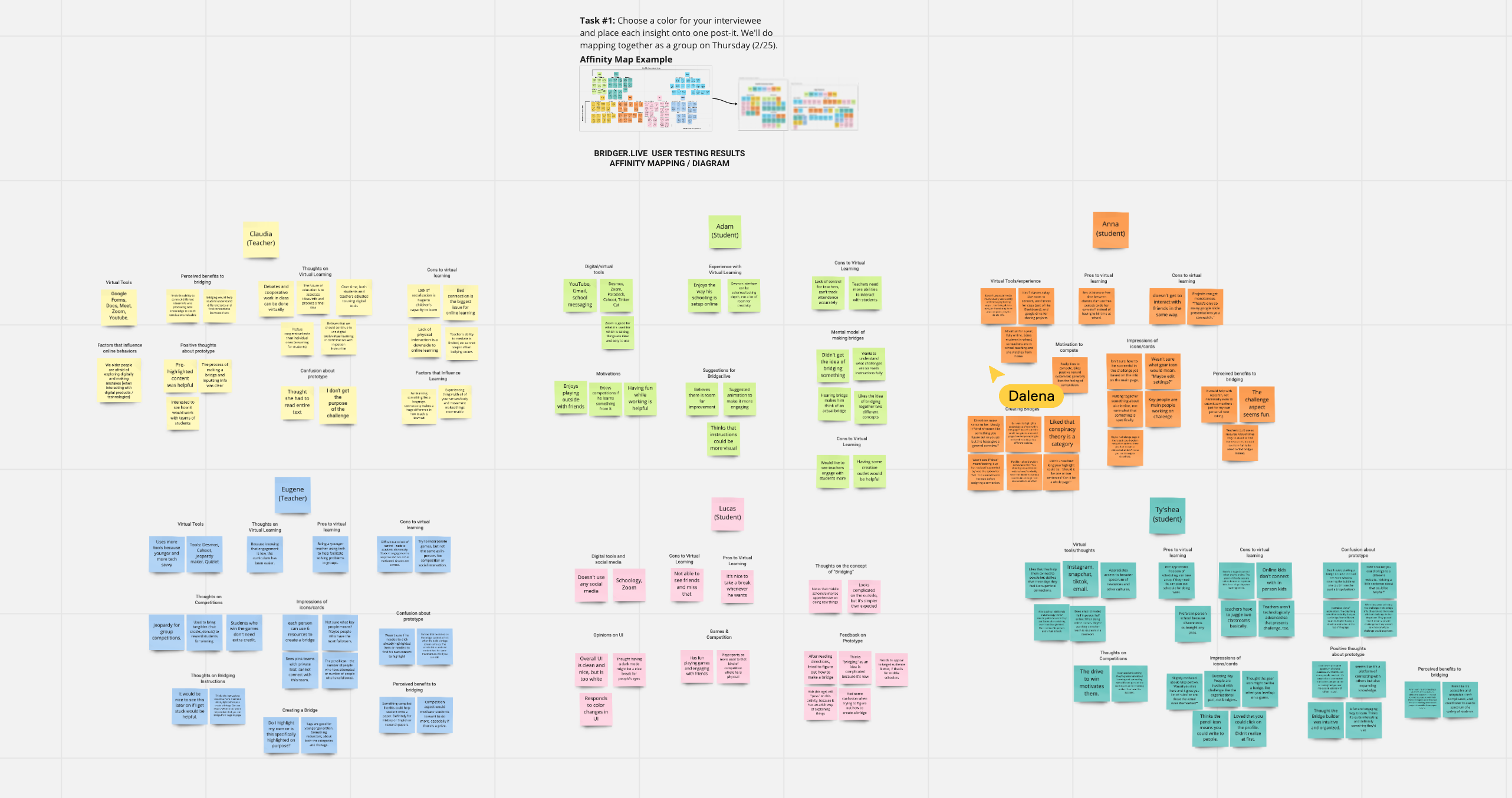
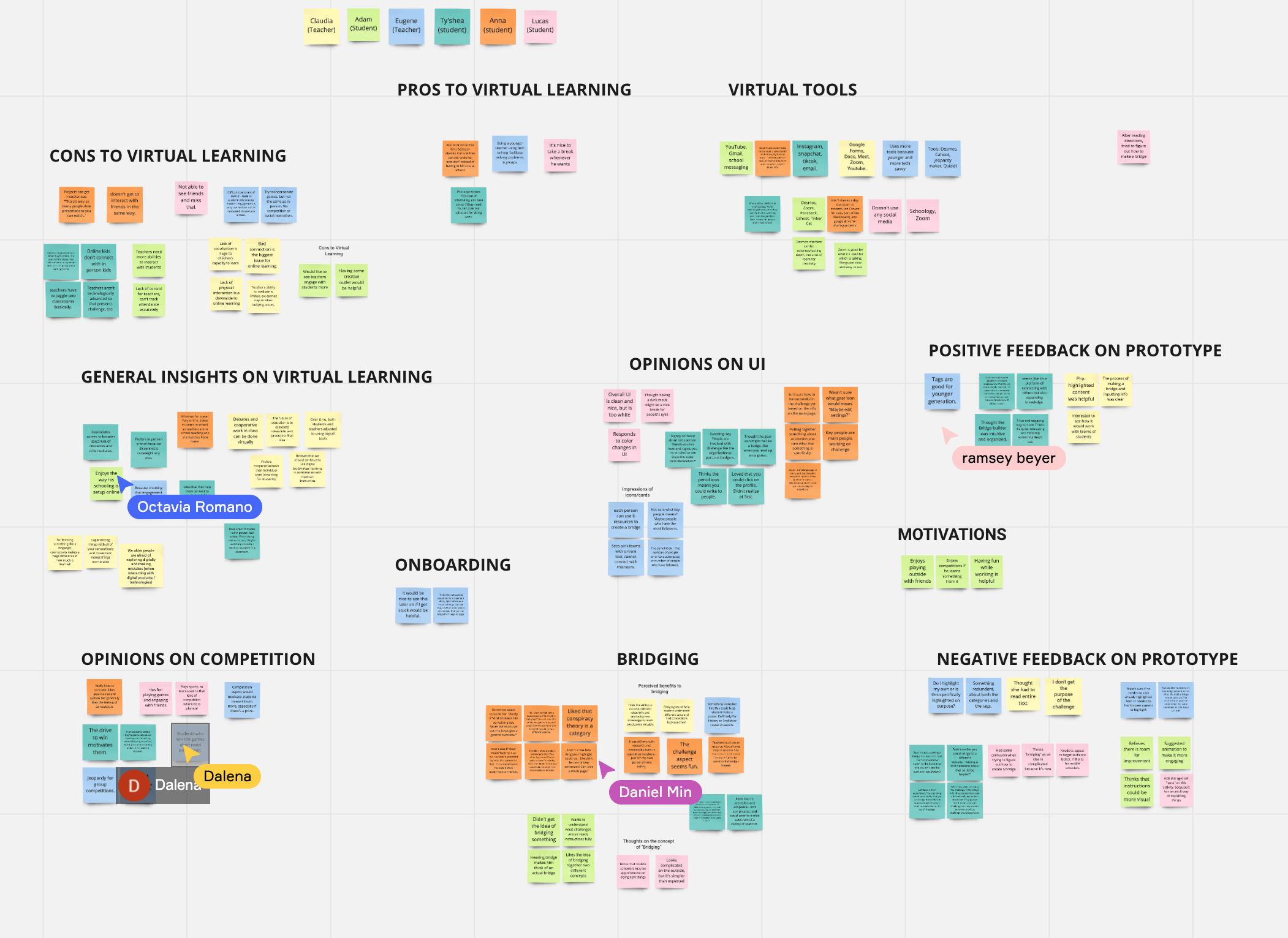
User testing results (audio):
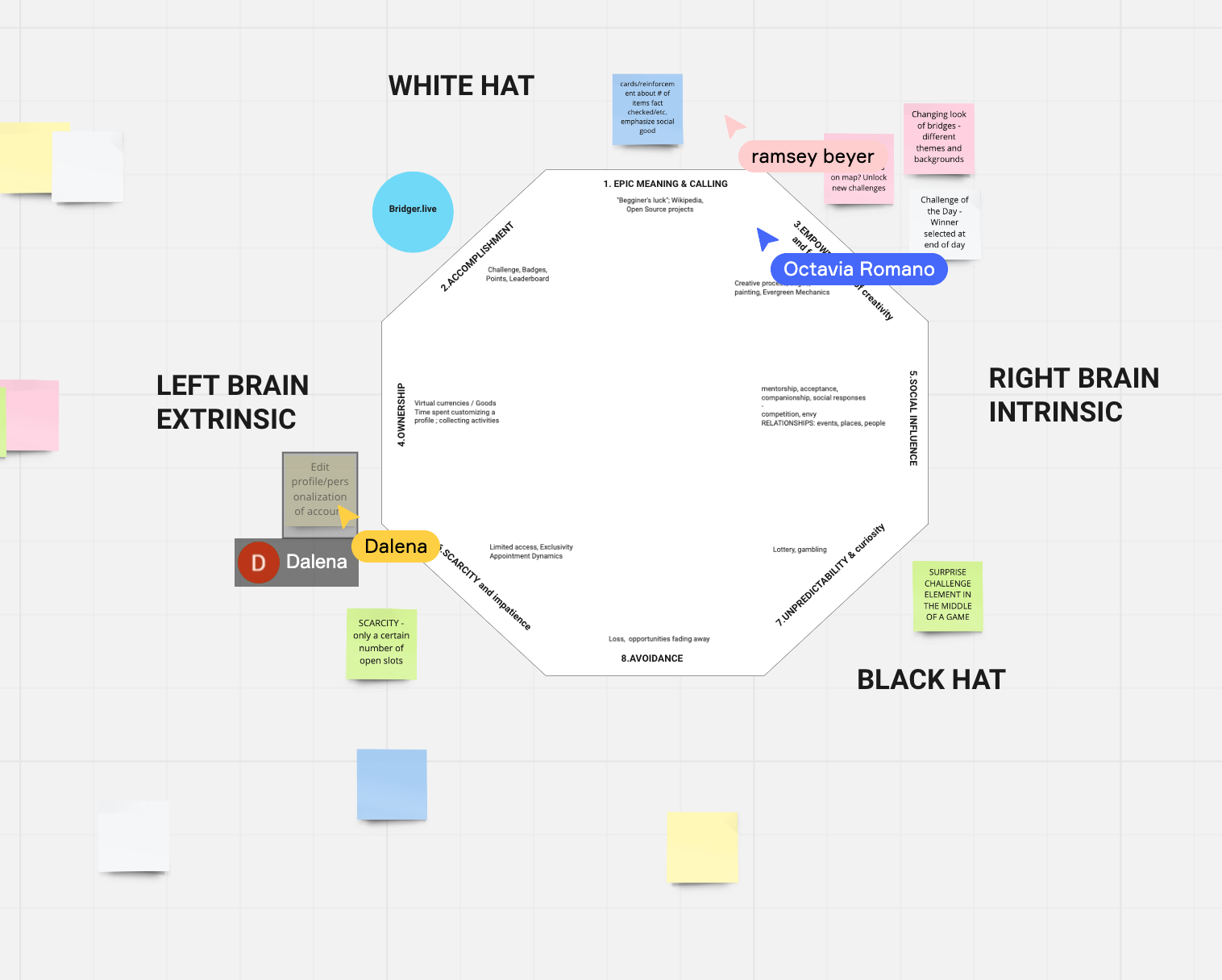
We conducted a group brainstorming session to work on the gamification aspects of Bridger. We used the Octalysis Framework to help identify the aspects that were already present on the POC prototype and to generate new ideas for other interactions on Bridger.
To build the design system for Bridger, we kept the following guidelines and objectives: accessibility, integration of Bridger with the Skool brand and use of Ant Design (React UI) as reference. We also followed the Atomic Design methodology to create a master component library.
In order to create the Bridger logo and brand, I followed the Skool platform logo as reference, keeping the primary brand color (pink) and replacing the Skool logo green for blue on the Bridger logo. This way Bridger could be integrated with the Skool brand, while still remaining a separate application.
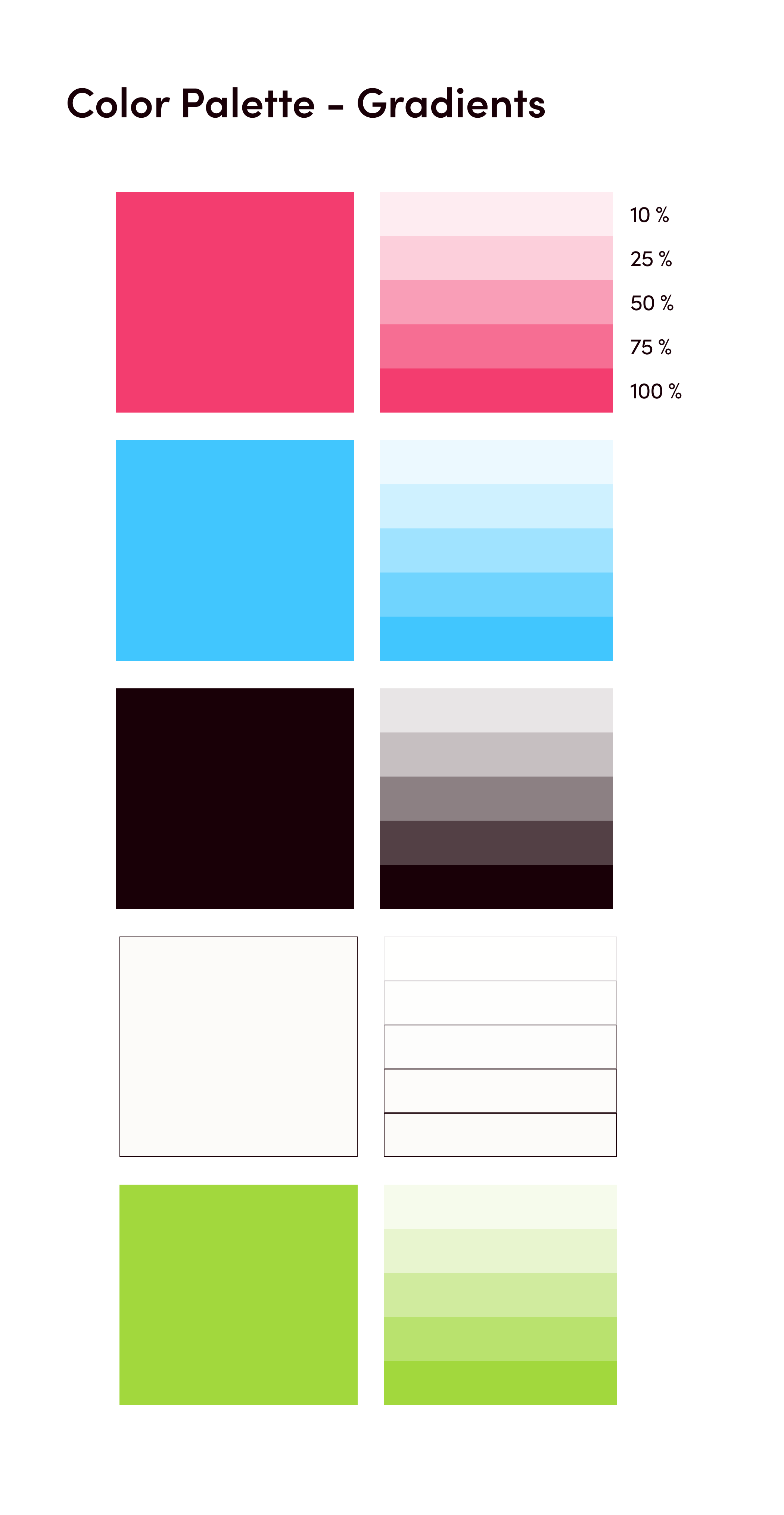
The next step was to generate a color palette and color style guide for the Bridger brand. The criteria followed was to adjust the palette to accessibility guidelines for color contrast and legibility.
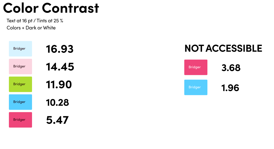
We found the primary and secondary brand colors were limited in terms of accessibility, so we decided to build the palette using neutrals and use color sparingly. Also, since the application would involve a considerable amount of information and interaction, we wanted to avoid overwhelming the user by keeping a minimal, clean look.
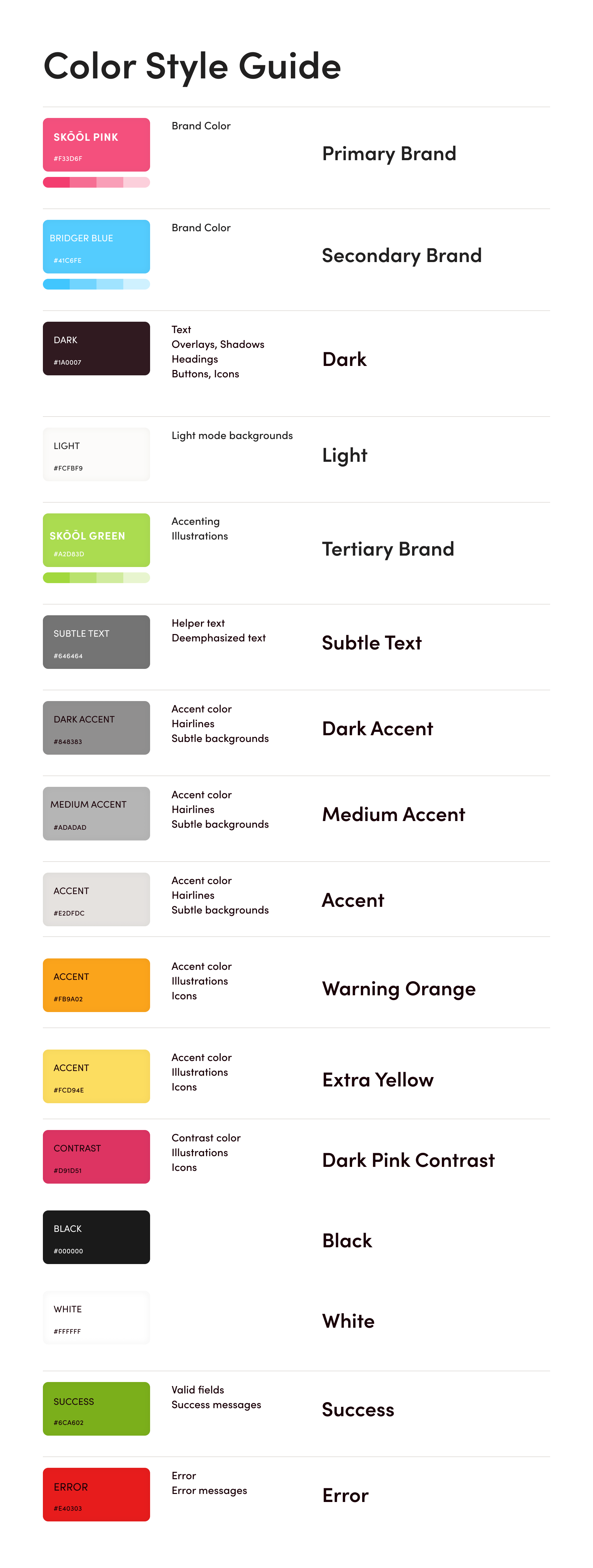
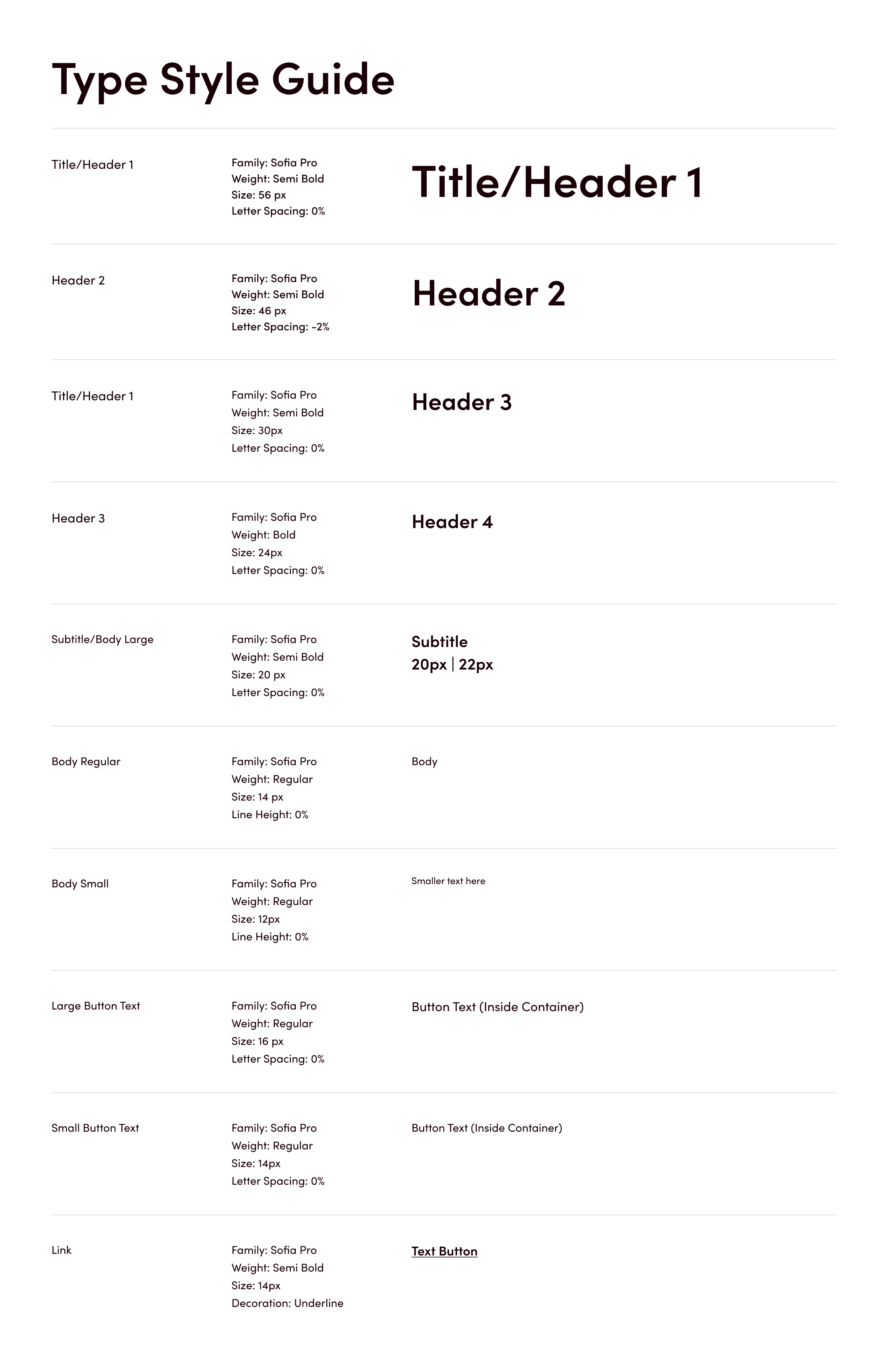
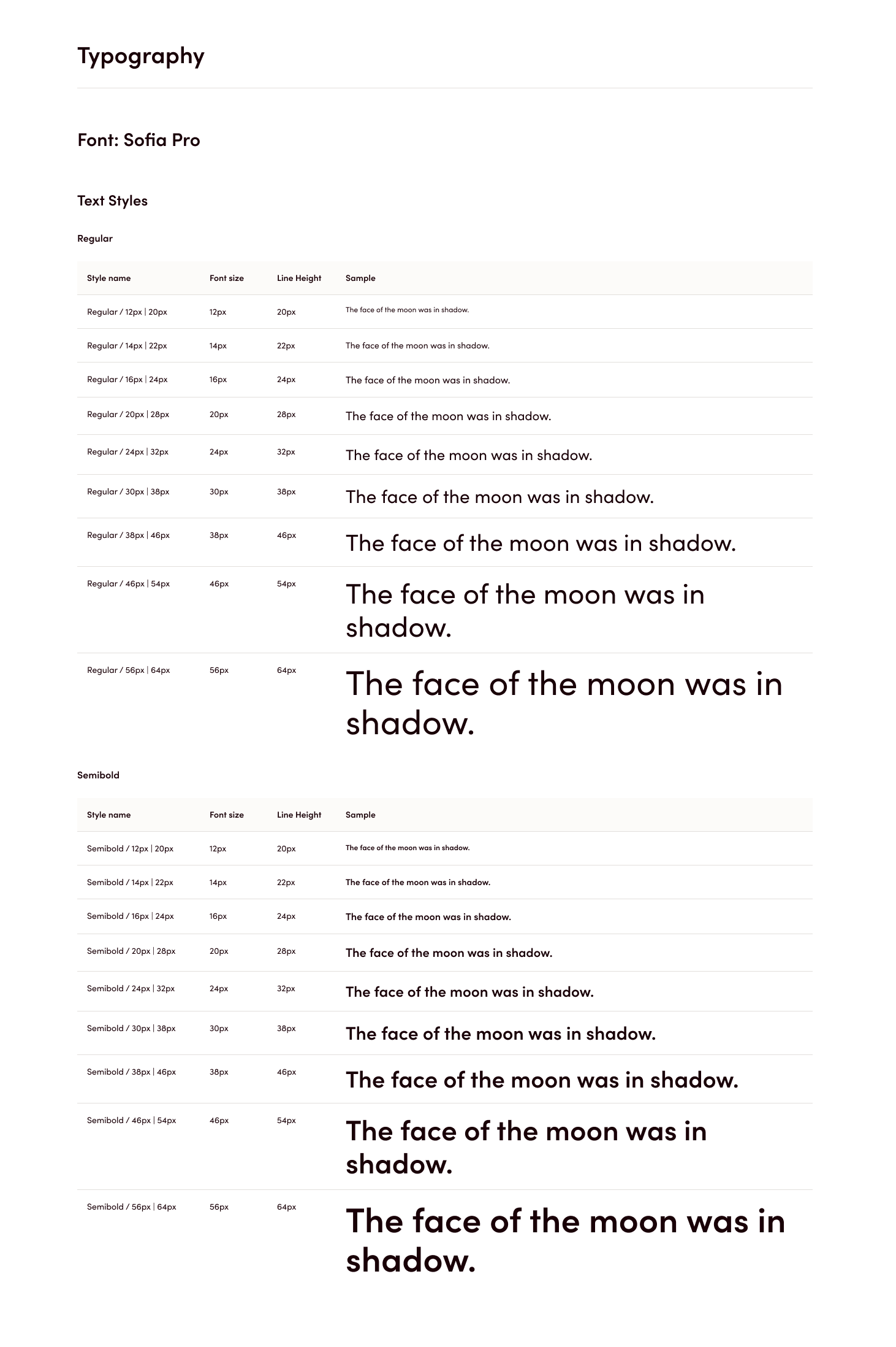
In terms of typography, we chose Sofia Pro (Adobe), a simple Sans Serif font, to ensure legibility.
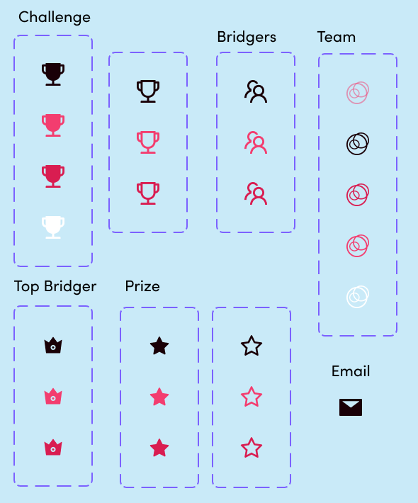
For icons, we referred to Ant Design library: we adapted Ant icons to be used for specific functions and elements of Bridger, including Challenges, Bridgers, Prizes and Top Bridgers.
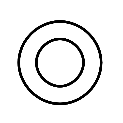
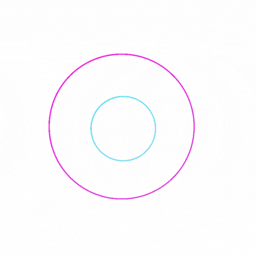
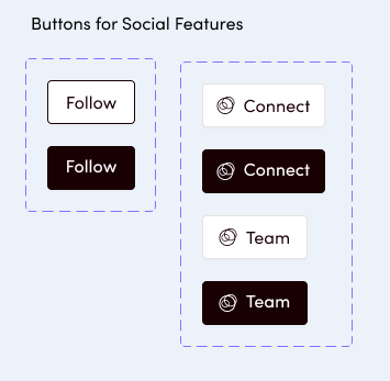
I also created a custom icon to represent social interactions on Bridger, including Connect and (create) Team features.
Lastly, I participated in the Value of Bridges project, which involved collaborating with a marketing specialist, in order to find different ways in which to introduce new users to the concept of "bridging". This process involved content strategy, copywriting and some visual explorations.
"How might we represent the concept of a bridge visually?"
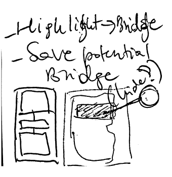
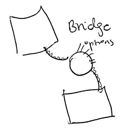
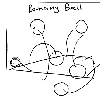
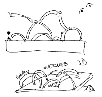
Some sketches I made to explore ideas on how to represent a bridge visually